Branding is what gets communicated with just a glance. It’s the visual shorthand that conveys your ideas long before a reader sees your words — through your colors, fonts, and layout.
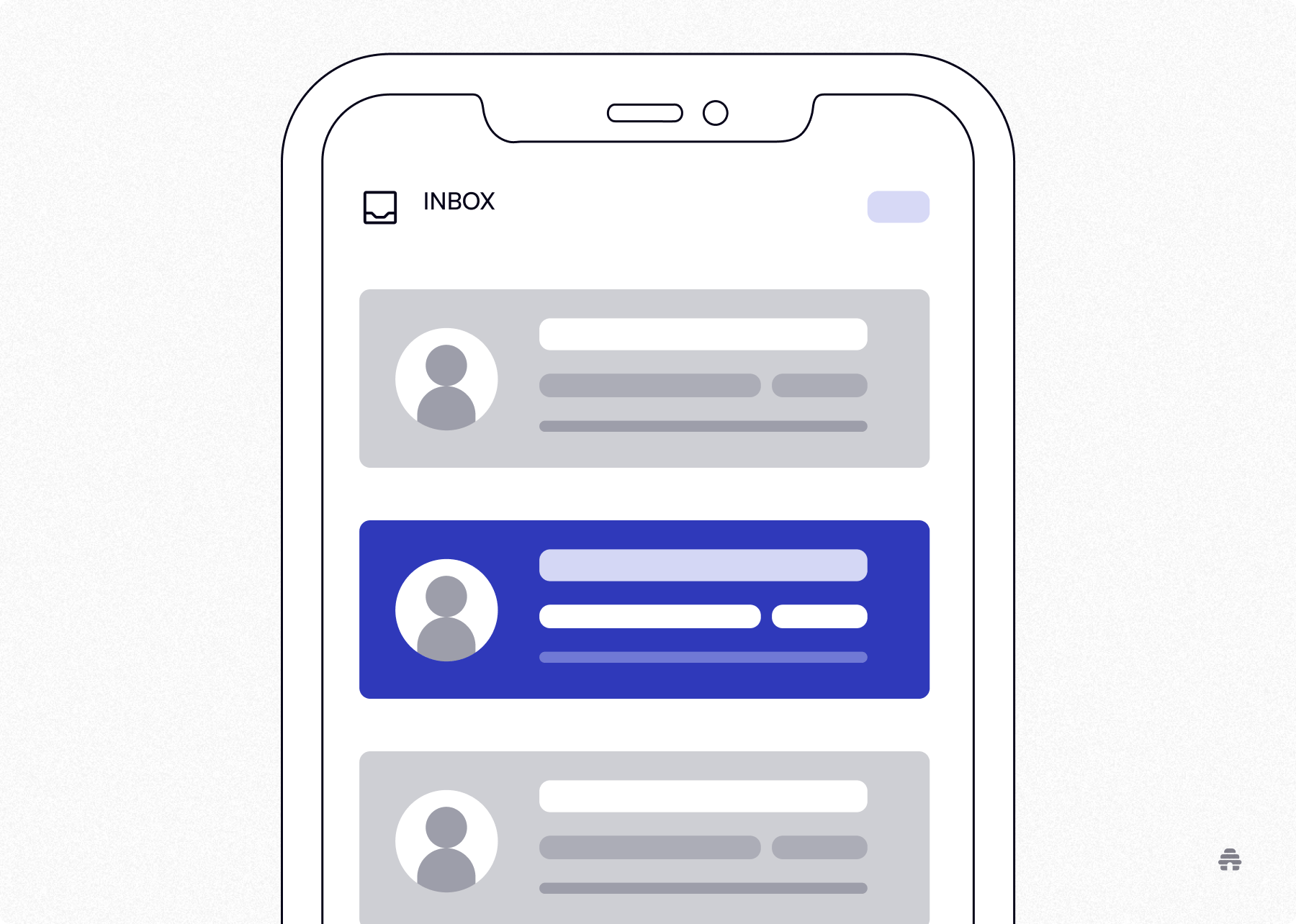
This may sound shallow, but branding allows for snap recognition. And in a crowded inbox, branding is what determines whether your newsletter gets opened or ignored.
People ask me all the time, “Are newsletters effective anymore?”
Want to know the real answer? Only when the branding is effective.
Whether you’re creating newsletters for marketing or for personal purposes, you need branding. After testing dozens of layouts, voices, and tones, I’ve learned what reliably increases reader recognition and long-term retention.
Table of Contents
To stay top-of-mind, you have to actually stick in your reader’s mind. That’s exactly what sticky newsletter branding does. Through consistent messaging, strong visual identity, and a definite personality, your audience learns to recognize your newsletter’s voice, transforming from a generic email into a familiar friend.
Newsletter logo ideas and catchy names are usually the start of branding. I emphasize the start. I’ve learned that effective newsletter branding has three components; and, if you miss one, you miss a touchpoint.
Choosing a Consistent Visual Identity
Take comfort in knowing that you don’t need a graphic design degree to create a sticky visual identity. You just need to tinker around until you find what bodes with you and stick to that.
Here are a few things to consider:
Typography: This is the voice of your design, so keep it simple. Choose distinct fonts for your headers and something readable for the body. I prefer Arial or Times New Roman. It might sound boring, but I can depend on these fonts to read well on both websites and mobile.
Color: Save your hex codes for your primary and accent brand colors.
Visual Hierarchy: These guide your readers’ eyes, like you’re leading them through your house. You’ve got your header as your front door, down to your branded footer to sign-off goodbye.
Consistent Visual Anchors: If you think your newsletter needs to look different from week to week, let me shock you with the importance of having the same visual cues. Use the same icons, divider lines, or section names to anchor your readers’ eyes, especially if they’re skimming through.
Defining Your Voice and Personality
Your visual identity generates immediate recognition, but your voice is what maintains interest. Your audience keeps reading because they want to hear what you have to say.
Developing your voice and personality through writing is a skill; and, just like with any other skill, it requires trying and failing. When you find your voice, you will know because it’s what feels authentic to you. You’ll read it and think, “This sounds exactly like me.”
Let’s start with the 3C’s of communication:
Clarity: Say it simply.
Consistency: Sound the same everywhere, all the time.
Character: Integrate your uniqueness.
With the 3C’s as a foundation, you can explore how phrasing, sentence rhythm and even formatting can reflect your brand.
What I check is my “Style Guide:”
Vocabulary: By this, I mean your vocabulary. Are there words you commonly use? The Hustle uses “scoop” and “folks.” This might seem insignificant, but it reinforces your voice.
Cadence: This refers to the tone and pace of your writing. Do you like longer paragraphs that set the scene, or do you like shorter, punctuated paragraphs? I personally lean toward the punchy, hard to skim past without reading ones. Milk Road has this type of staccato cadence.
Formatting: Your voice cannot only be heard through your words but also through your layout. If your brand is efficient and concise, use bullet points, lists, and bolding. Why Words Win is a weekly newsletter that sends out actionable tips to boost conversions, in reads that are under five minutes. This is enhanced by their formatting.

This may sound daunting, but your brand voice isn’t something you come out of the womb with. It’s a skill you develop, and that involves experimenting and trying different things. Maybe you start out with an intro that is punchy and short but later feel like that’s not really you.
As long as you’re paying attention to what flows and is authentic to you, you’ll find your voice.
However, being authentic to yourself doesn’t mean ignoring who is on the other side of the screen. It takes some trial and error to learn how to write with your audience's expectations in mind.
What do I mean by this? Take into account your audience’s needs. If your readership is mostly busy executives, brevity is valued. Your voice should be direct, understandable, and authoritative.
Whereas if you write for mostly content creators, inspire them! You can be more lyrical and visual.
Creating Emotional Recognition
Visual identity and writing with your voice create a sense of familiarity, but emotional recognition creates loyalty. When a reader sees your email in their inbox, they not only recognize who you are but also feel a certain way because of the way you make them feel.
You can build this by focusing on three specific areas:
Tone: This is different from voice, which is who you are. Tone is how you adapt to your reader’s mood. If you look at The Hustle, their tone is witty and aggressive, while The New York Times is more authoritative and calm.
Structure: Consistent formatting helps make your content feel trustworthy and dependable.
Sticky newsletters utilize structure to respect their audience’s time. It’s not boring to use the same headers/bullet point styles/visual dividers. Actually, it creates a psychological safety net. It requires less energy from your readers, and that predictability generates trust.
Rituals: Having recurring segments, like Big Desk Energy’s “Tracks of the Week” or a specific sign-off, are rituals. It’s something consistent that readers can depend on and look forward to. You could even use inside jokes to make your audience feel like they are part of a community.
I want to highlight the theme behind these points: fostering psychological safety. People are constantly internally weighing out risk and reward. Is it worth the “risk” to open your email? The risk I’m talking about is not malware software, but readers are subconsciously wondering if opening your email is worth their time.
Your tone creates emotional safety. When your audience sees your email in their inbox, they’re expecting your witty and cynical tone. Don’t go scaring them by all of a sudden changing your tone to a corporate one.
A reliable structure promotes cognitive safety. You can lower the “cognitive tax” of reading with your formatting. Axios has their “Why It Matters” section in a predictable place, so readers don’t have to scroll and figure out how to consume the content.

Lastly, rituals create social safety. Having recurring segments and inside jokes creates a sense of belonging. This is huge because there is safety in numbers, and you’re welcoming your reader into the community.
I know the header is in the past tense, “How I’ve Developed My Own Newsletter Branding,” but the truth is, it should be, “How I’m Developing My Own Newsletter Branding.” Newsletter branding isn’t a one-time development but an ongoing process.
I thought I had to be perfect from the get – go with the perfect font choices, formatting, and well-developed voice, but that’s not real life. That concept delayed my publishing, but I eventually realized that branding is something you learn as you go.
Branding, at its essence, is interpersonal. All of the decisions we make are with the goal of connecting with others. And as much as you can assume what people want and do what the research says, a brand isn’t something you can develop in a vacuum. You need to see how your brand interacts in the real world and learn what people are responding to.
You don’t have to be a mind-reader, but there are a few things you could do to give you a running head start.
Why Trust Me?
I’ve been an editor with beehiiv and started writing for them because I love their content. I’m a technical writer who pivoted to business-to-business (B2B) and direct-to-consumer (D2C) articles because of my knowledge of SEO strategies and optimization.
Testing Layouts and Templates
I like to think of layouts as the skeleton, the holding structure. I’ve tried so many different structures to see how readers would respond, but my constant goal was always for the audience to feel guided as they moved through the newsletter.
There isn’t a single “right” layout that works for your audience and the type of content you’re putting out. Once I stopped searching for that perfect layout, it freed me to focus on alignment between structure, content, and reader expectations.
Keep reading for some general guidelines I now use for layouts and templates.
Clarity Before Creativity
Going back to the goal of guiding the reader through your newsletter, your layout should make it clear where to start reading, where to pause, and where to go next.
Your readers have entrusted you with their time, so help them move through.
Structure With Content Density
If your content is on the shorter side, use more open layouts. But for longer content, use sectioning to decrease the cognitive tax.
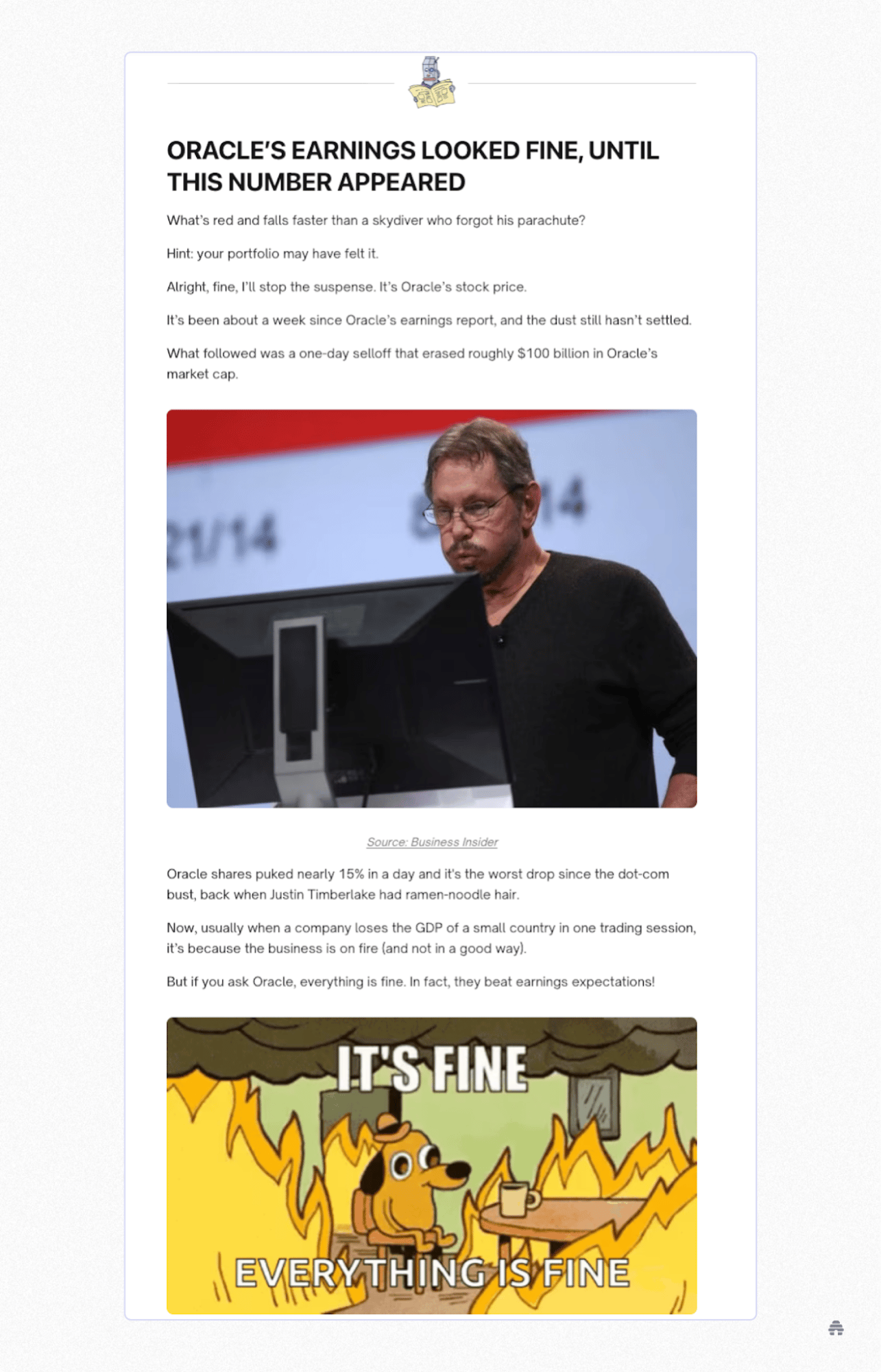
Milk Road is an example of a newsletter with long-ish emails that manage to not feel heavy because of their tight sectioning.
Repetition Equals Comfort
Don’t try to be so original that you avoid repeating. Repetition builds comfort for your readers. Create familiarity with the same section order, headers, and spacing.
Consistency is more impactful than novelty.
White Space Is Design
An important aspect of your design is white space. This isn’t wasted real estate because it creates pacing and breathability. It also makes your words weighty and intentional.
Check out the newsletter Why Words Win to see their use of white space, short paragraphs, and bullet points to create pacing. It increases the intentionality of their ideas and makes them easier to consume, making it a high-impact read.
Refining Color Palettes and Fonts
When I first started working with newsletters, my color palette was quite large because I wanted to keep things visually interesting – and it was interesting, alright…and distracting. You want to capture your audience’s attention, not overstimulate them.
I narrowed my color palette down to these three categories:

Primary Color: This is your main base color that reflects your newsletter’s tone.
Accent Color: This is a complementary color that you can use for emphasis.
Neutral Colors: These are for backgrounds, to help your primary and accent colors pop.
I tried to fit my entire voice into my fonts, but this will relieve you, as it did me: your font choices don’t have to capture and express your whole personality. This is just one of the many components of branding, so just pick what fits your writing voice.
I found that heavier fonts like Oswald and Inter made my newsletters seem more assertive and direct, while lighter serif fonts like Merriweather and Georgia felt more personal and reflective.

Regardless of what font you choose, prioritize readability. Your readers could be checking out your newsletter on their laptops or phones, and you want it to be a pleasant and engaging experience on both.
Keeping Design Consistent Across Campaigns
Consistency is key to effective branding. While you do want your emails to be well-designed, one nicely crafted email doesn’t equal a brand. Consistency and repetition create recognition.
But what if you’re unhappy with your initial branding choices? Do you just have to stick with them because consistency is key?
That’s what I had thought, so I had so many drafts that never got published because I wanted them to be perfect. But instead of being perfect, learn to pivot.
Use visual anchors that never change, even if you change other things. This still gives your audience touchpoints.
Change one thing at a time: If you’re feeling iffy about your font choice for the body, keep everything else the same while swapping it out. If you want to rehaul your entire color palette, you could introduce it while keeping your logo the same, or you could be upfront with your audience that you wanted new colors. Honesty helps build trust.
Keep your top 200 pixels steady: This is the welcome mat to tell your readers they’re in the right place.
Create a “Master” template. I did this in beehiiv’s Website Builder and created copies for every newsletter sent out. Any edits I made in branding, I did to the Master template so that things would remain consistent.
How beehiiv Makes Branding Easier
Here’s the thing: you could do everything I said right -- pick the best fonts, color palettes, and layouts, but implementing them can be a technical nightmare.
As someone who has built websites on different platforms, I spent too many hours fighting with HTML codes just to get a button to look just right. This was not only frustrating but also slowed down my publishing timeline. It made me wish I had a coding degree, but I needed a solution that was faster and more intuitive.
Then, I started using beehiiv’s Website Builder, and it changed the branding game for me.
Using Website Builder for Cohesive Design
The greatest advantage I discovered in using beehiiv is automatic brand synchronization. Prior to beehiiv, my newsletter and website were isolated from each other, resulting in brand drift.
Brand drift is the subtle, unintentional disconnection of your identity across platforms. Because my website and newsletter were on two different platforms, I had to go in manually to update both.
This actually happened to me, where I changed the hex code of my accent color on my newsletter but forgot to do so on my website and sent it out. It wasn’t because I’m careless. I had made so many minute changes that one inevitably slipped through the cracks.
Truthfully, I hadn’t noticed the inconsistencies. I didn’t get explicit feedback from my audience that they noticed the differences, but click and open rates decreased. I realized that they sensed a subtle friction between my two platforms.
beehiiv smoothes out this friction because the Website Builder directly pulls from the same source as the newsletter. This makes your newsletters a live, in real-time extension of your brand.
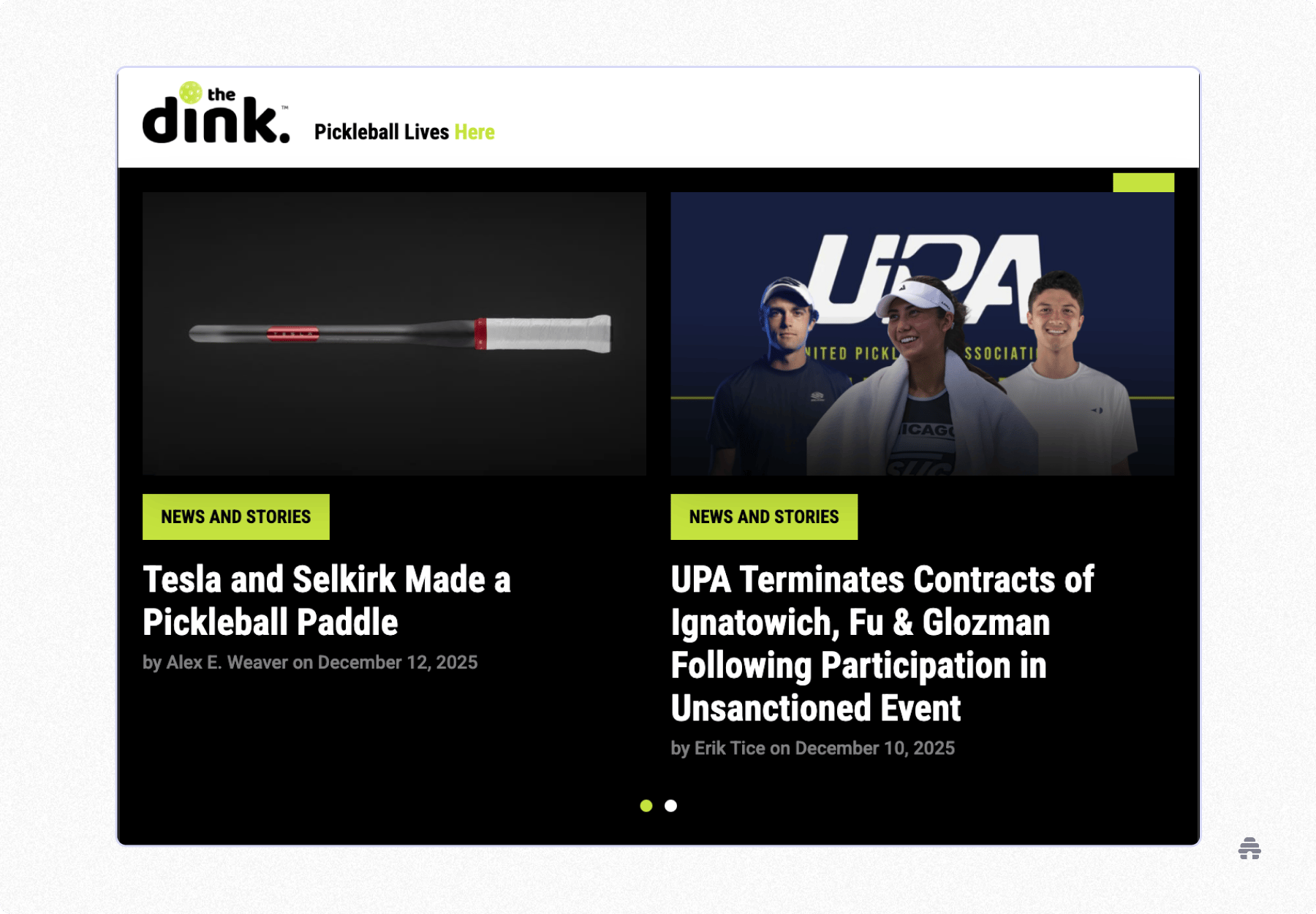
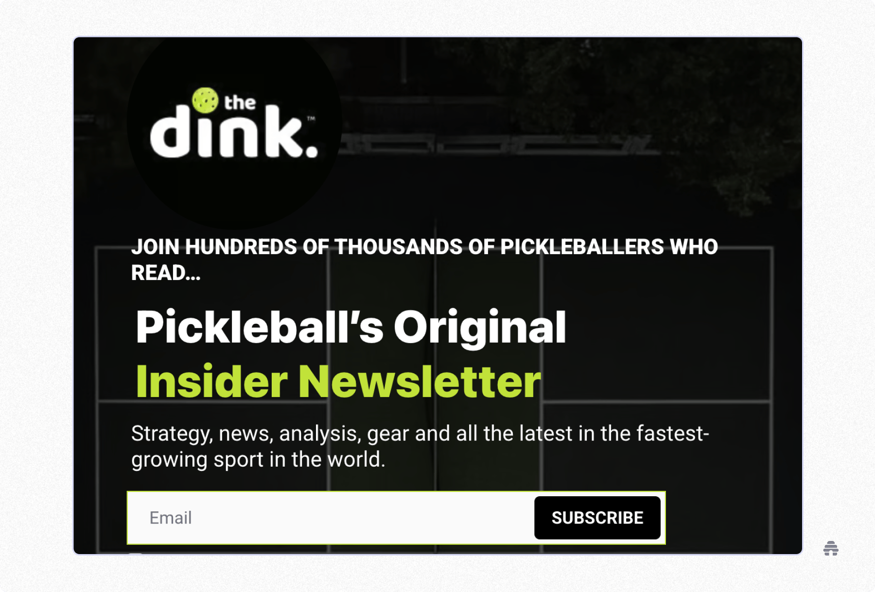
Check out the seamlessly aligned design in The Dink’s website and newsletter. The layout, fonts, neon green and black colors are identical. There is zero friction, just one continuous experience.
Customizing Templates Without Code
I used to think that custom branding meant custom coding. And with the help of YouTube tutorials, I tried it. I dug into the HTML and cascading style sheets (CSS) to get a specific border radius around my buttons.
Though I learned a lot, I also went down many rabbit holes because of not having a coding background and thinking I needed to code all the elements of my newsletter to achieve originality.
Originality doesn’t mean you have to start from a blank page. I learned that the most effective way to brand isn’t to build from scratch but to add your own flair.
What convinced me were beehiiv’s professional, pre-made templates that have already been coded for mobile and readability. I used these as a foundation and then added my own touch with the visual builder.
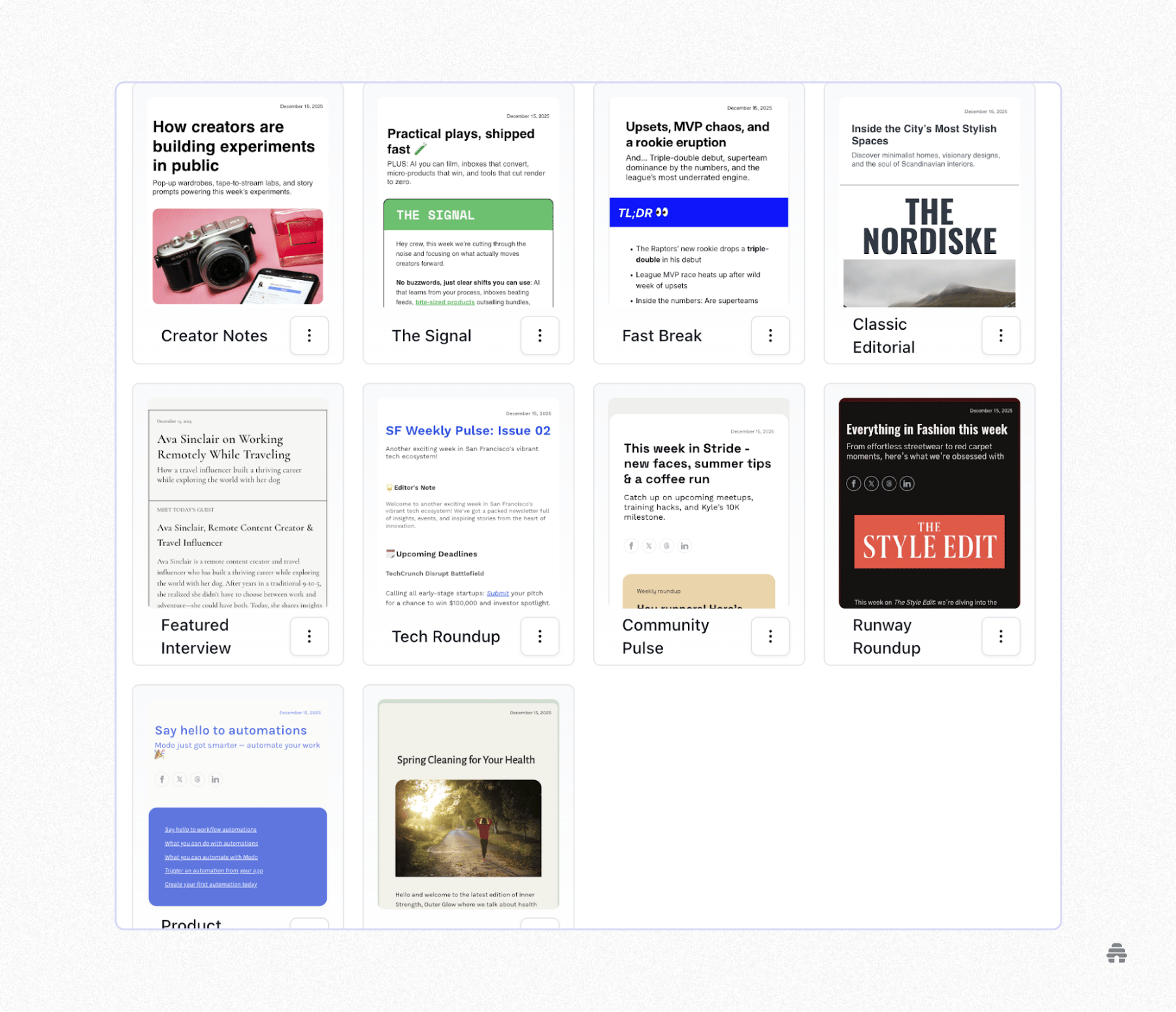
This saves you from going down so many rabbit holes, like figuring out whether something looks better on the left or on the right. And the cherry on top is that because beehiiv is an all-in-one platform, my template choices automatically applied to my website, too.
Creating Branded Automations and Workflows
Prior to beehiiv, and with a lot of self-effort, I was able to send out well-crafted newsletters on Tuesday mornings, but these were accompanied by generic, lackluster emails. This took a hit on my branding.
Branded workflows and automations are crucial to ensure that every interaction is an experience. beehiiv helps you apply your design style and voice to them so that your branding is clearly communicated.
For the “Welcome” email, I used beehiiv to build a Welcome Series. This didn’t turn out to be more work because I used the same visual templates as my newsletter.
I use the Design Lab for more “boring” emails like feedback requests. The key is to utilize your “visual anchors,” meaning the same fonts, colors and shapes so that even transactional emails feel cohesive.
What I’ve Learned About Building Newsletter Branding
If I could do it all over again, the main lesson I would keep in mind is not about color choices or font types. It’s that your brand is not a costume; it’s a mirror.
Your brand is an extension of yourself. So if your message isn’t strong or the care for the audience isn’t clear, a spot on hex code can’t save you.
The best newsletter brands aren’t the ones with the best design but the ones that know who they are and are unapologetically true to themselves.
Don’t worry about being perfect. In fact, forget about that. The best brands evolve in the public eye. There is something very raw and genuine about a brand that listens to its readers and adapts its identity organically over time.
What you need to succeed is a platform that allows you to evolve. That’s why I chose beehiiv. They gave me the design tools I needed to launch a newsletter, but they also gave me the flexibility to grow and develop with time and audience feedback.
You don’t have to take my word for it. Sign up for beehiiv and build sticky newsletter branding for yourself!

